
In rent-controlled markets, lease incentives can be framed as a race: discount to market vs. free rent. It's a recurring decision—a unit becomes vacant in your rent-controlled building. Market rent is $2,400. You have two standard options:
- Option A: List at $2,250 (discount to market)
- Option B: List at $2,400 with 2 months free rent
What is the best option to offer potential tenants?
The simple math
Most asset managers start here: how much time needs to pass for these options to cross over?
It's a bit like the story of the tortoise and the hare.
- Discount-to-Market is the tortoise — collecting revenue immediately from day one, but at a slower rate ($2,250/month).
- Free Rent is the hare — sprints at a faster pace once it starts ($2,400/month), but spends the first two months collecting nothing.
How do we decide who to bet on in the race?

The math is straightforward. The hare forfeits a $4,800 head start by providing two months of free rent, but catches up at a rate of $150 per month. Without accounting for time value of money or rent growth, the tortoise and hare cross paths at month 32.
After we factor in our discount rate, expected market rent growth, and guideline increases, the math shifts. They now cross at month 37.
How do we decide which leasing strategy is optimal? We compare how long our tenants stay to the cross-over point. If the average tenant stays for 30 months, we're better off discounting rent–the tortoise wins the race because there isn't enough time for the hare to catch up. But if the tenants stay longer, say 40 months, the hare wins.
Easy decision, right?
The relay problem
But there's a complication: this isn't a one-time decision. When the first tenant leaves, the unit is leased up again. When the second tenant eventually leaves, it's leased for a third time. And so on.
Our tortoise versus hare race is actually a relay that runs for the entire time we own the building.

Here's the subtle assumption most models make: the runners on both relay teams are running the same distance. Underwriting often summarizes these outcomes with a single average—36 months—applied uniformly across leasing options.
But our experience tells us that tenant behavior varies dramatically based on the rent they are paying versus the current market rent.
The tenant with a $150/month discount (tortoise) has something to lose by moving. Every month they stay, they're saving money versus market rate. They are unlikely to give that benefit up and will stay much longer than 36 months.
The tenant at market from day one (hare) has much less to lose by moving. If market rents go down, or they get frustrated, or a competitor offers a deal...there's no financial penalty to leaving. They are much less likely to stay 36 months.
So while on average tenants might stay 36 months, tortoises might run 50 months and hares might run 30 months. Maybe no tenant actually stays 36 months–the average is just a blend of very different behaviors.
And that's the problem: our crossover analysis tells us the hare needs to run 37 months to beat the tortoise. But without knowing how long tortoises and hares actually run in our buildings, we can't make the optimal decision.
We may have an intuition about this, or follow a general rule. But we're choosing a relay team pattern for our entire hold period based on a guess.
Modeling turnover
The good news is that we can predict how long tenants will stay if we have enough data.
Your historical lease data provides tremendous insight into how tenants in your buildings behave at different rent positions. How long they stay when they're at market versus 5% below market versus 15% below market. How their tenure changes as their discount shrinks or grows over time.
That data reveals your buildings' Turnover Curves—the relationship between a tenant's rent position and how long they will likely stay.
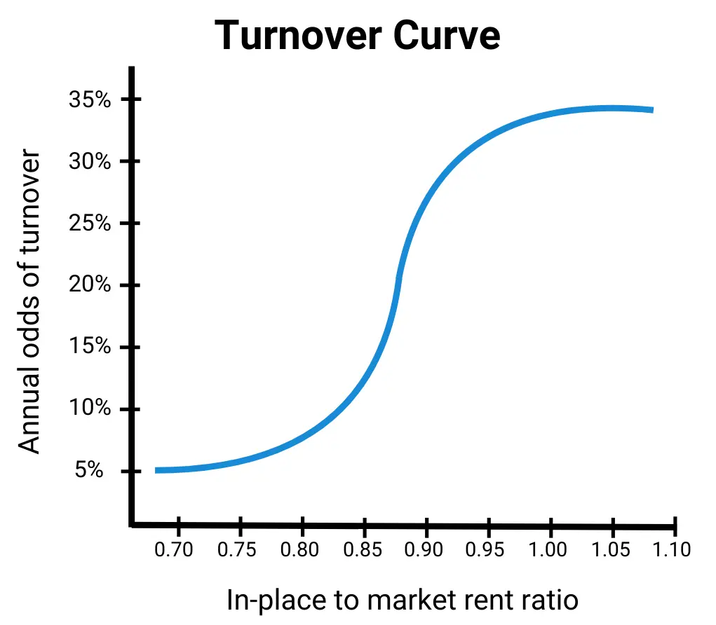
Some markets show dramatic tenure differences between tortoises and hares. In others, the difference is minimal. For example, your one-bedrooms in Toronto likely follow the same curve whether they're in Building A or Building D, while your two-bedrooms in Montreal might follow another. The more units of each type you have, the clearer the pattern becomes—and the bigger your data advantage.
Understanding those patterns is how you move from guessing to actually knowing the answer.
And the stakes are higher than a single lease: every vacancy decision you make isn't choosing one tenant—it's choosing the pattern for a relay team that runs for your entire hold period.
The pattern compounds. Once you know your one-bedroom turnover curve, you're not just optimizing one vacancy—you're optimizing leasing decisions for every one-bedroom across your entire portfolio, for years.
So: tortoise or hare? Your competitors are still guessing who will win the race based on rules of thumb and intuition. You can make the decision based on how your tenants actually behave–using your data to your advantage.
ReturnSuite provides analytical tools to Principal Owners looking to make better acquisition and operational decisions in complex real estate systems—like using turnover curves to optimize lease-up decisions in rent-controlled markets.